MOUNTAIN PROJECTS
Product Makeover
Year: 2026
Scope: 3 weeks
Disciplines: Product Design, UX Design, UI Design
Refreshing a Trusted Climbing Platform
Mountain Projects is a crowd-sourced digital guidebook for rock climbers. A well trusted app by climbers from all skill levels. But, Mountain Projects is extremely outdated and is starting to get beat out by newer, cleaner, simple apps. My goal is to implement a new visual strategy that will give the app a new clean look while still maintaining key brand elements
I will be taking light research and testing to then implement this new visual strategy that will take this product forward.
Understanding the Climbers
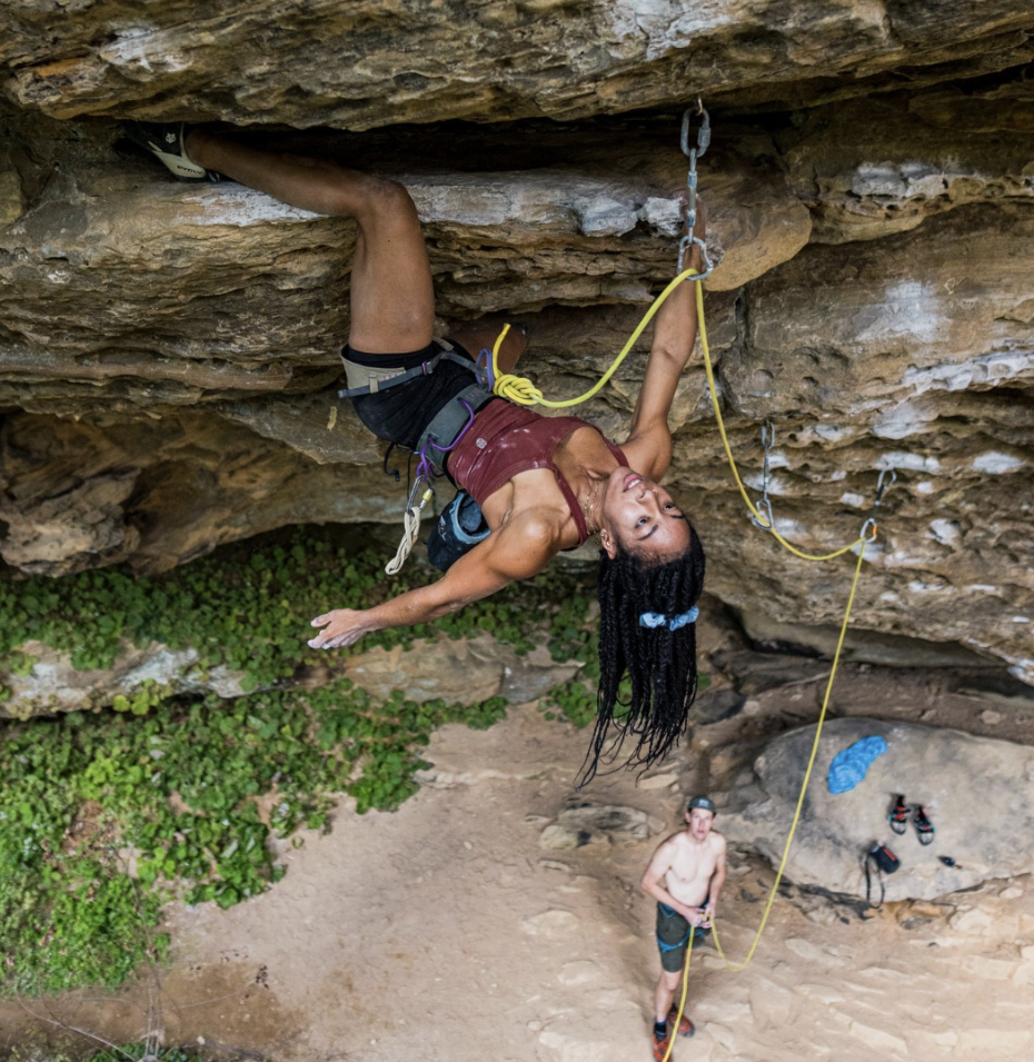
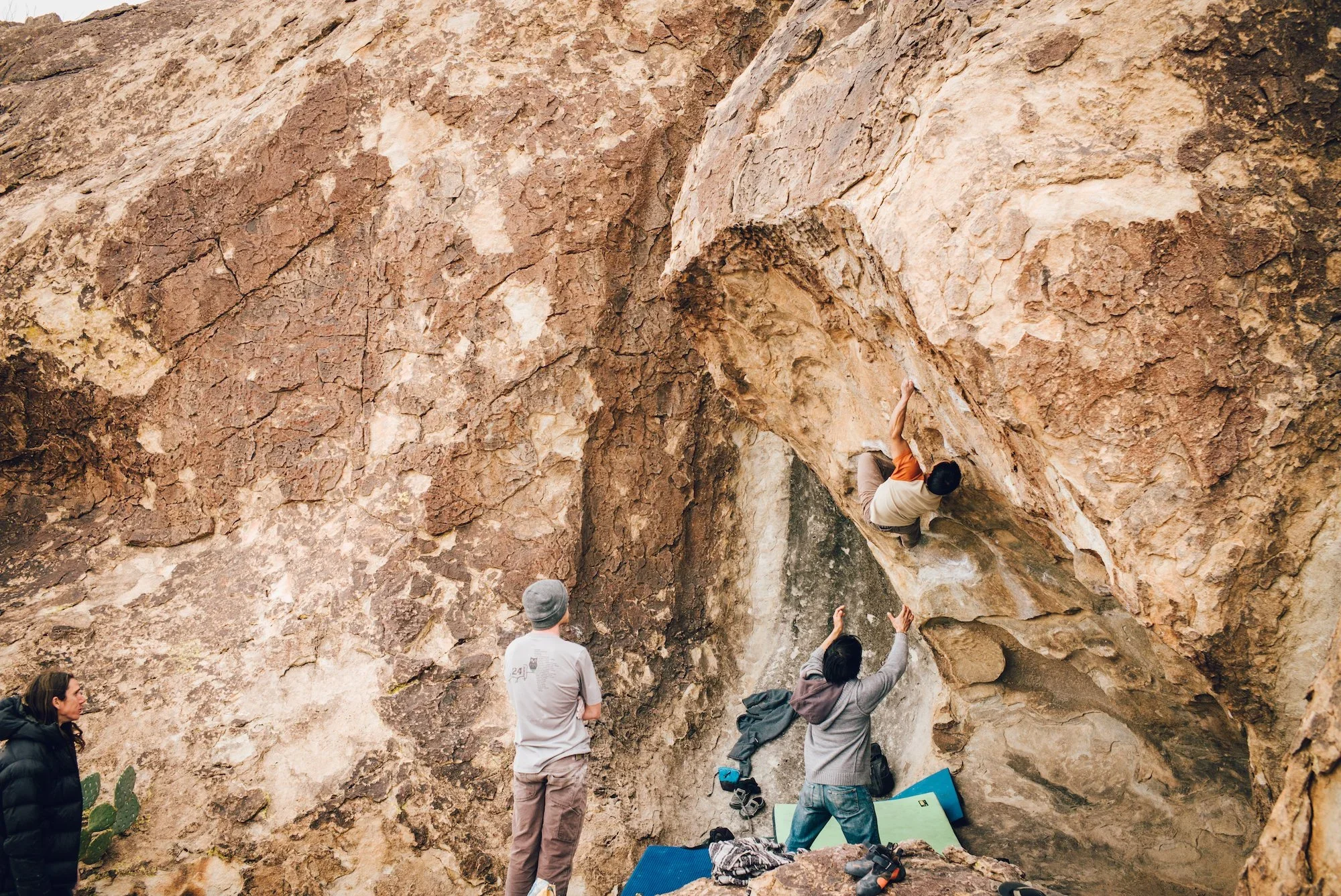
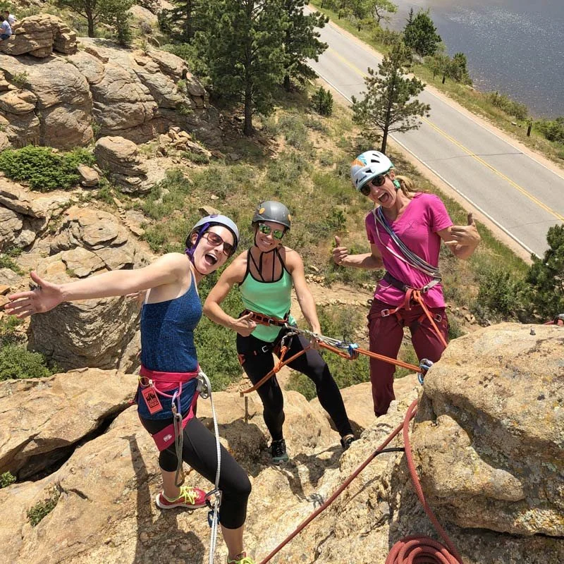
Mountain Project’s primary audience rages from 18-35 and includes climbers of all skill levels, from beginners to highly experienced athletes. Users rely on the app to discover climb, plan trips, track completed routes, and connect with the climnbing community. While the platform supports climbers across local, regional, and international destinations, it is most widely used throughout the United States.
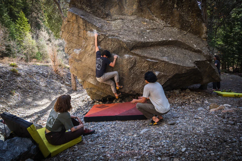
The Old
Mountain Project is a digital climbing guidebook— a community-powered database of climbing routes worldwide that climbers can access via web or mobile app.
Outdated UI, confusing to navigate, unclear visual hierarchy, and technical language make it difficult—especially for beginners—to quickly understand labels and find the information they need.
What’s The Competition?
Mountain Project’s competitors with newer climbing platforms such as TheCrag, OpenBeta, and Rakkup. Their simplified interfaces and easy navigation highlight the growing demand for a more polished and user-friendly climbing app experience.

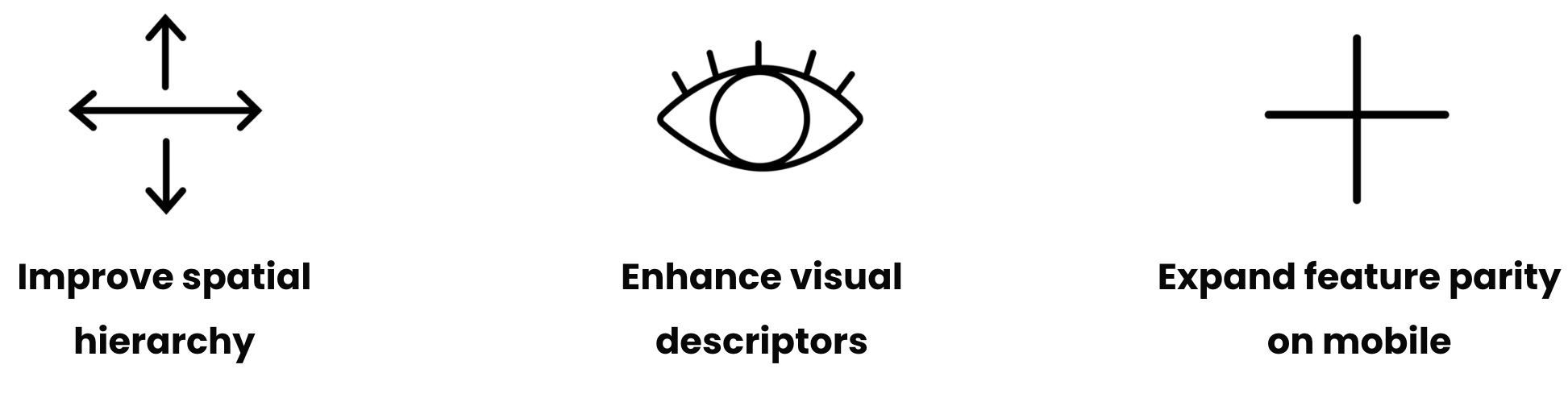
The Goal
In order to implement a more simplified seamless look, I would need to create more whitespace and a more simplified layout, using more modern UI elements for a more updated and intuitive feel. I also plan on updating the app for faster navigation, expanding an in app comment section to bring the community together more than it, enabling real-time user interaction.
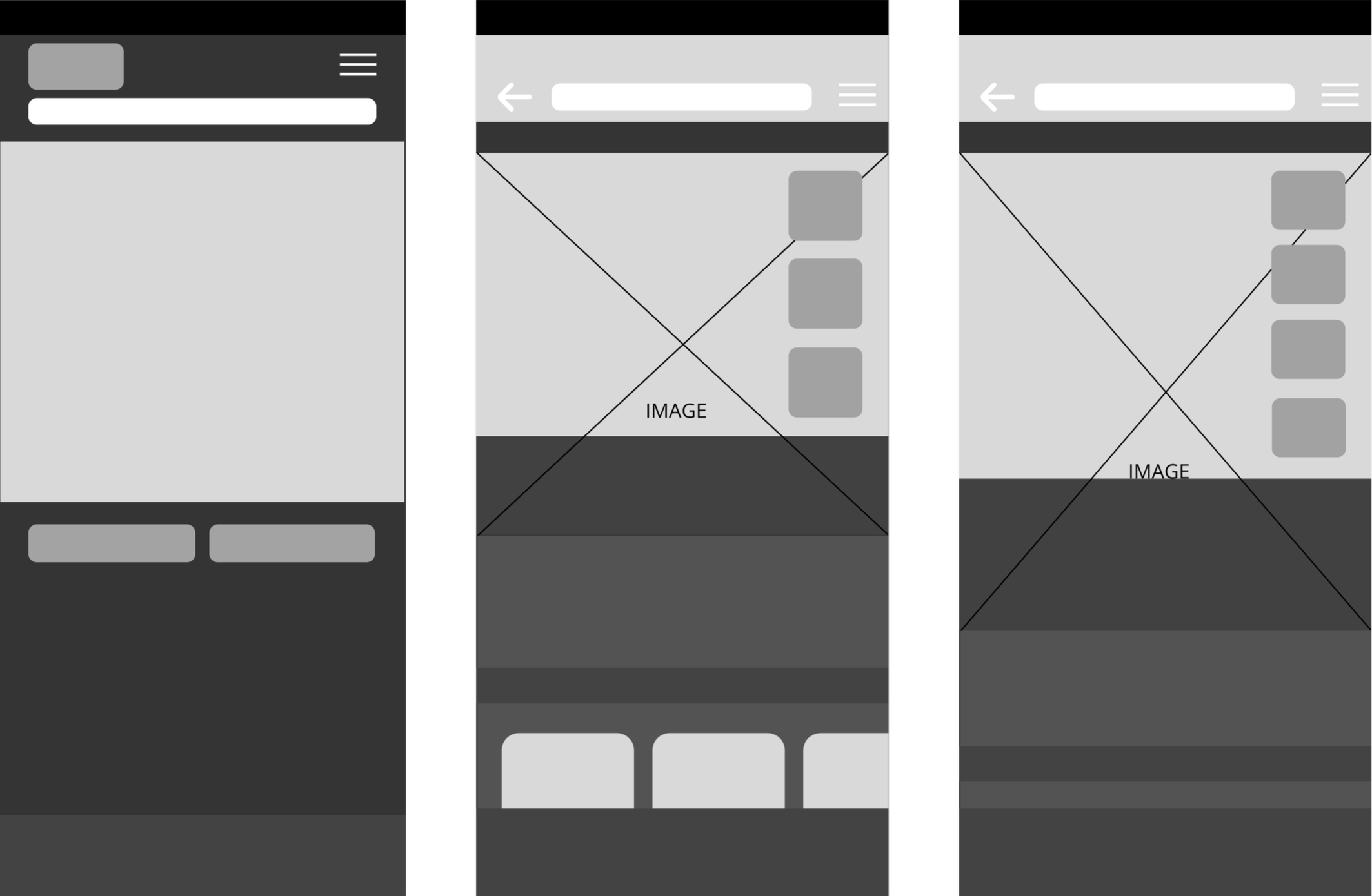
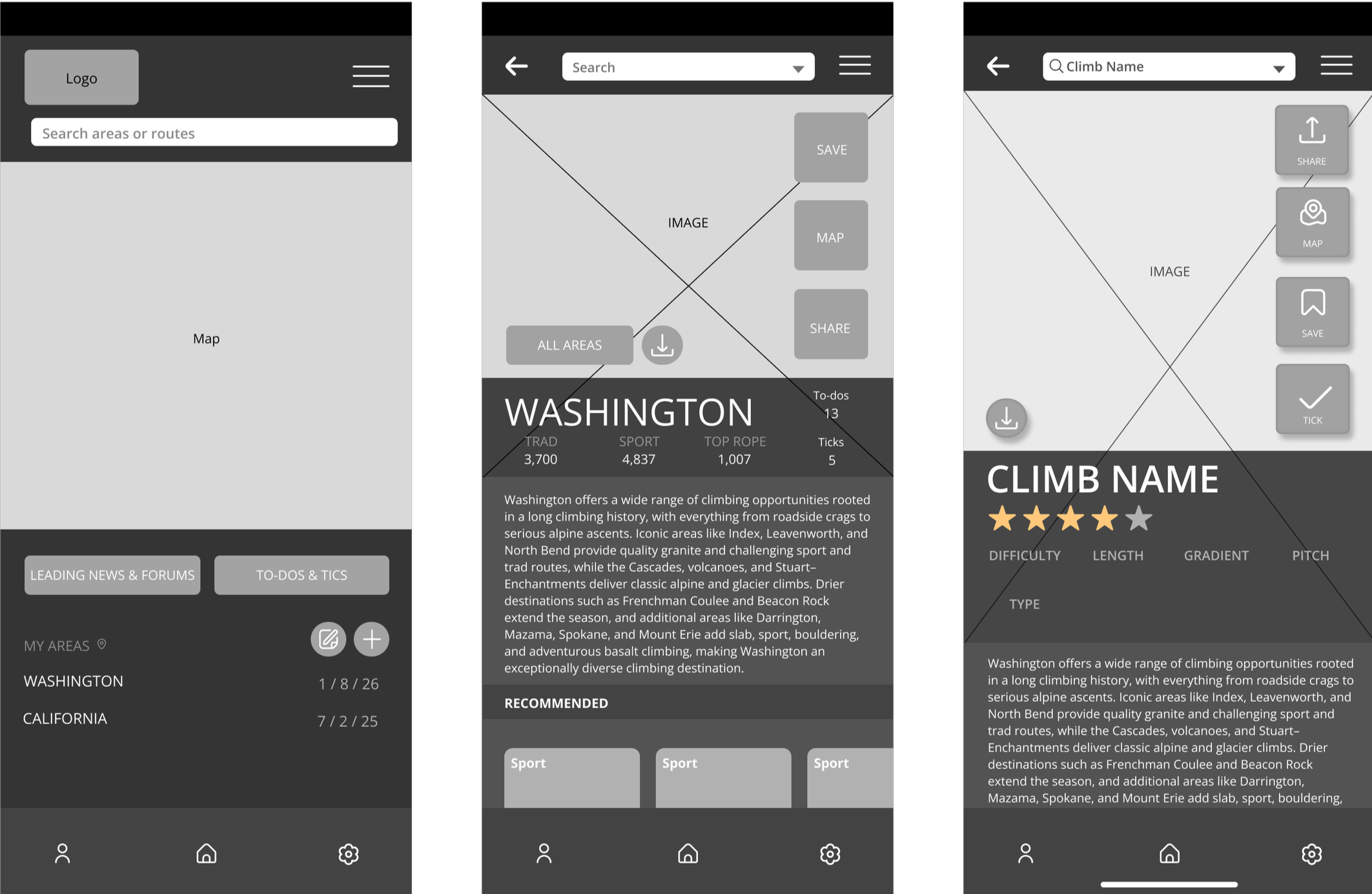
Wire Frames
Grayscale Wire Framing
My wireframes illustrate the placement of key components, including imagery, primary sections, and main action buttons, to establish a clear and intuitive layout.
Create a welcoming, easy-to-navigate app tailored to climbers of all experience levels. Improve usability by increasing visual spacing, adding clear written and visual labels, and updating the UI to create a more modern, efficient, and intuitive experience.
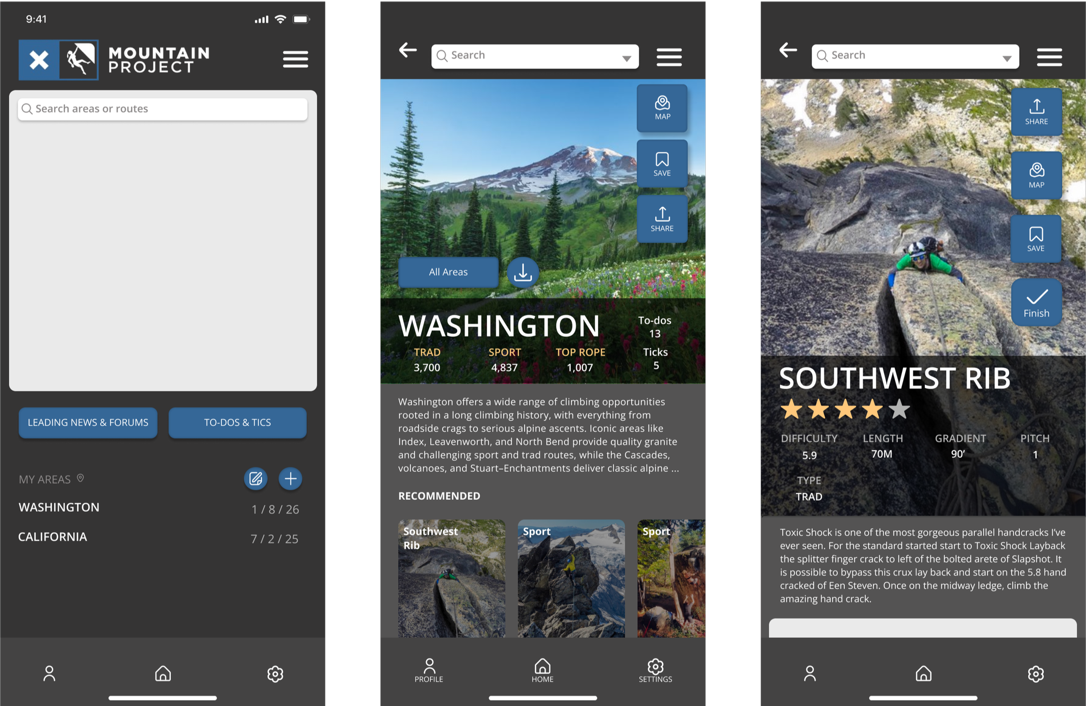
Mid-Fi Wire Frames
Then I began implementing the color palette to reinforce brand identity visual cohesion and continued refining visual hierarchy. I also adjusted component placement and layout to enhance overall usability and interface consistency.
Mid-Fi Wire Frames
After user testing, I developed first iterations of UI elements, including icons, button placement, text bubbles, headers, and recommended climbs.
I also established clear visual hierarchy through deliberate sizing of imagery and text, and strategic placement of categories and interactive elements.
After Usability Testing…
One tester suggested increasing space for images and reducing button size.
Another tester recommended adding labels to the icons on the home bar to increase accessibility for users who rely on translations.
Testers also proposed using a transparent gradient to create openness
Reorganized and simplify the info bars to enhance clarity and scannability
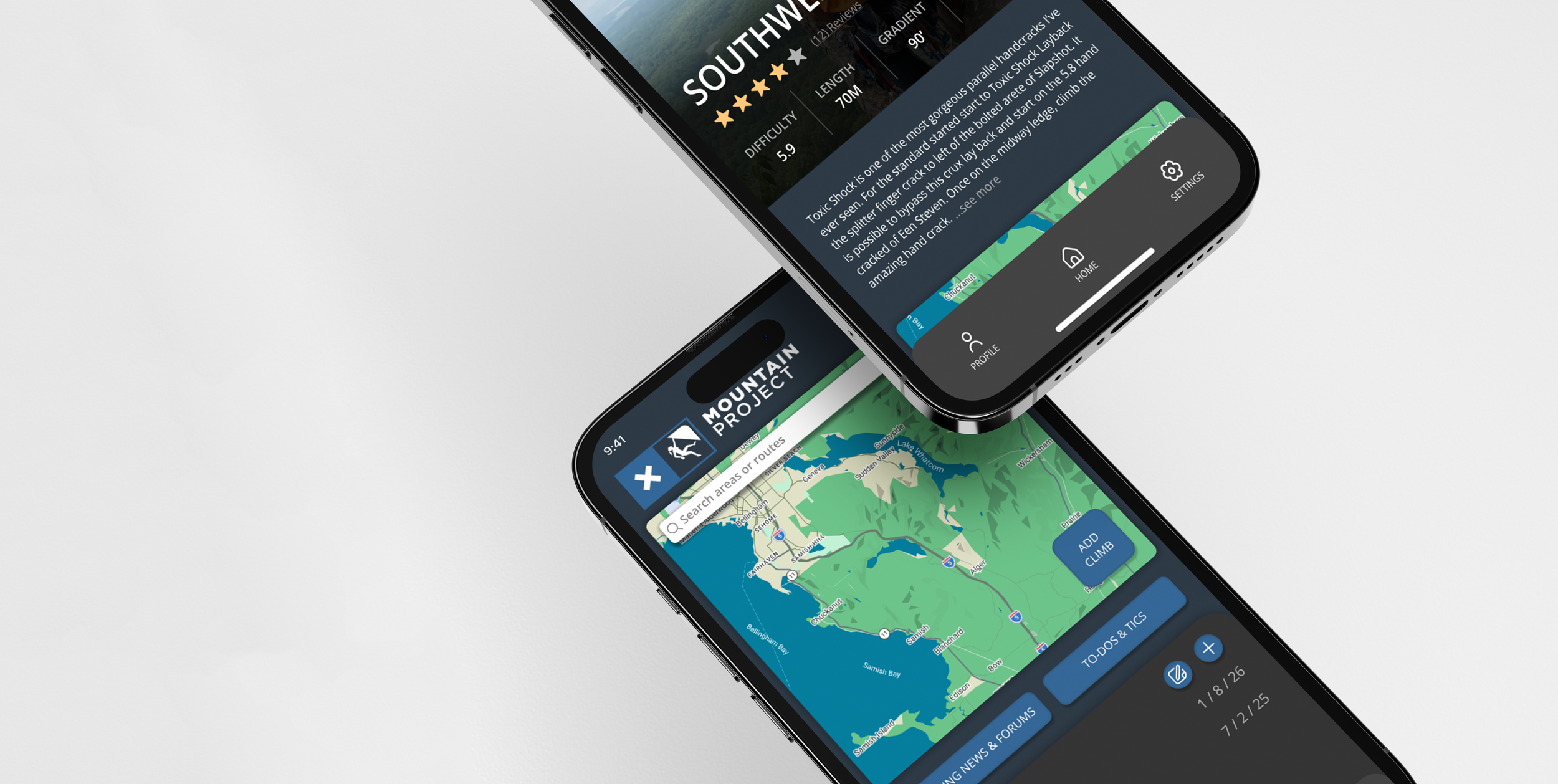
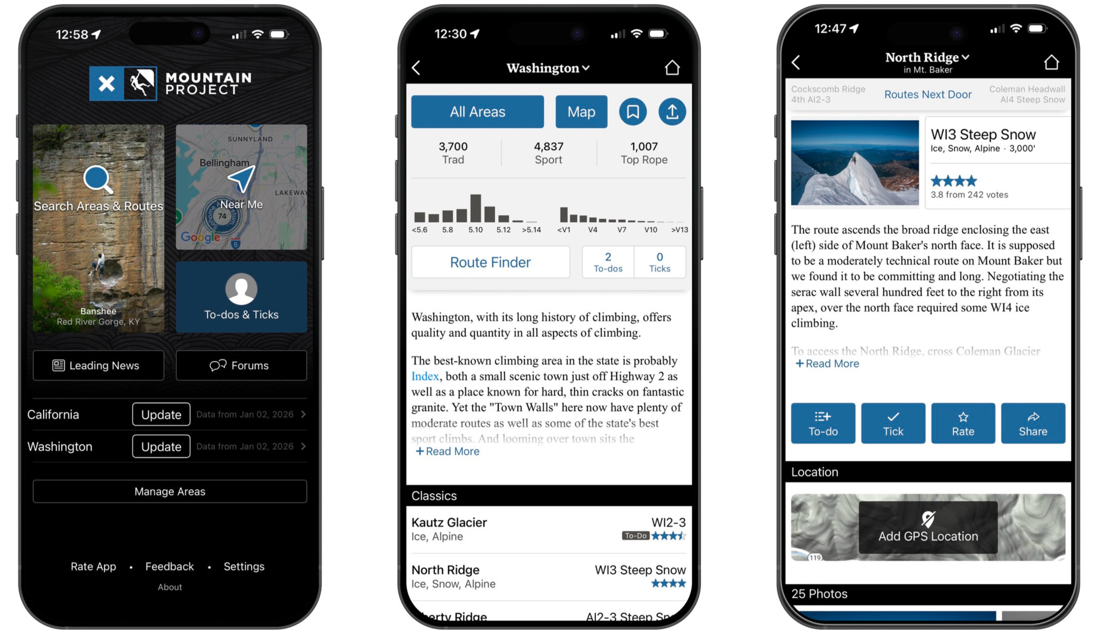
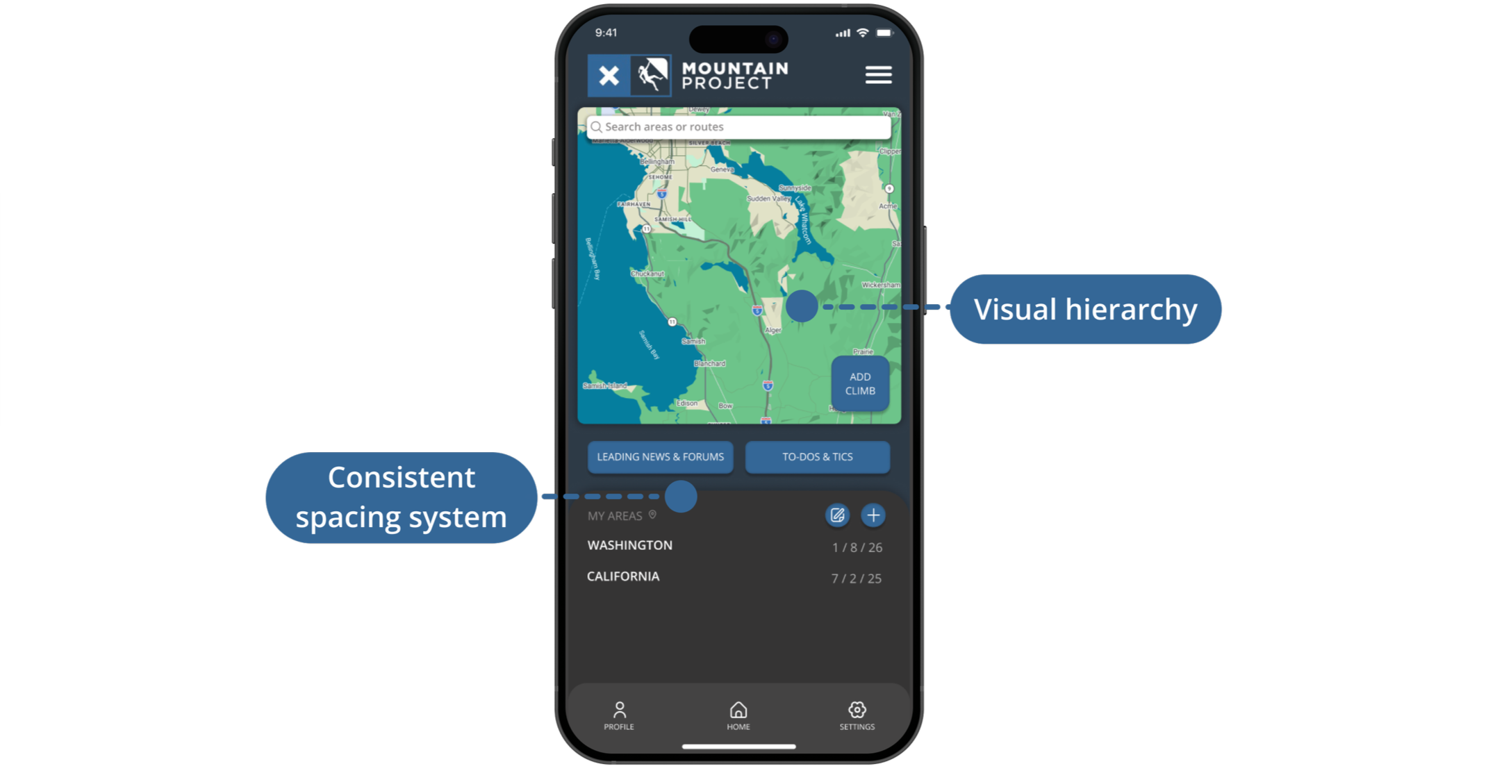
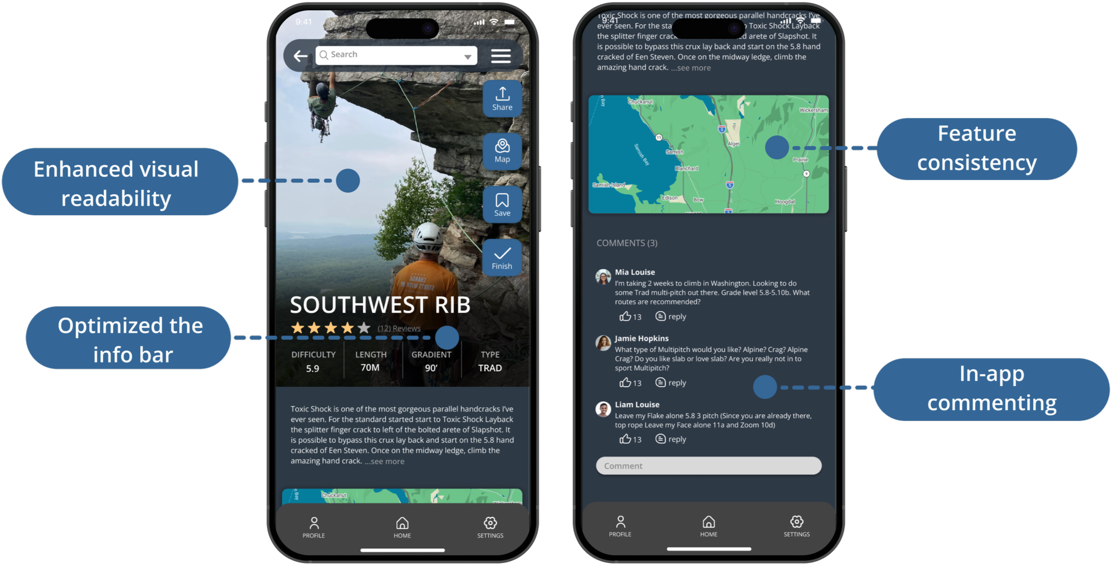
Final Prototype
Home Page
Established a clear visual hierarchy on the home page by emphasizing the map as the primary feature
Condensed secondary elements to reduce cognitive load and improve focus on key actions
Implemented consistent spacing to improve visual balance
States Page
Added representative imagery for each state to provide immediate environmental context
Refined button placement and alignment to support intuitive, efficient user interactions
Introduced a persistent bottom navigation bar for quicker way-finding
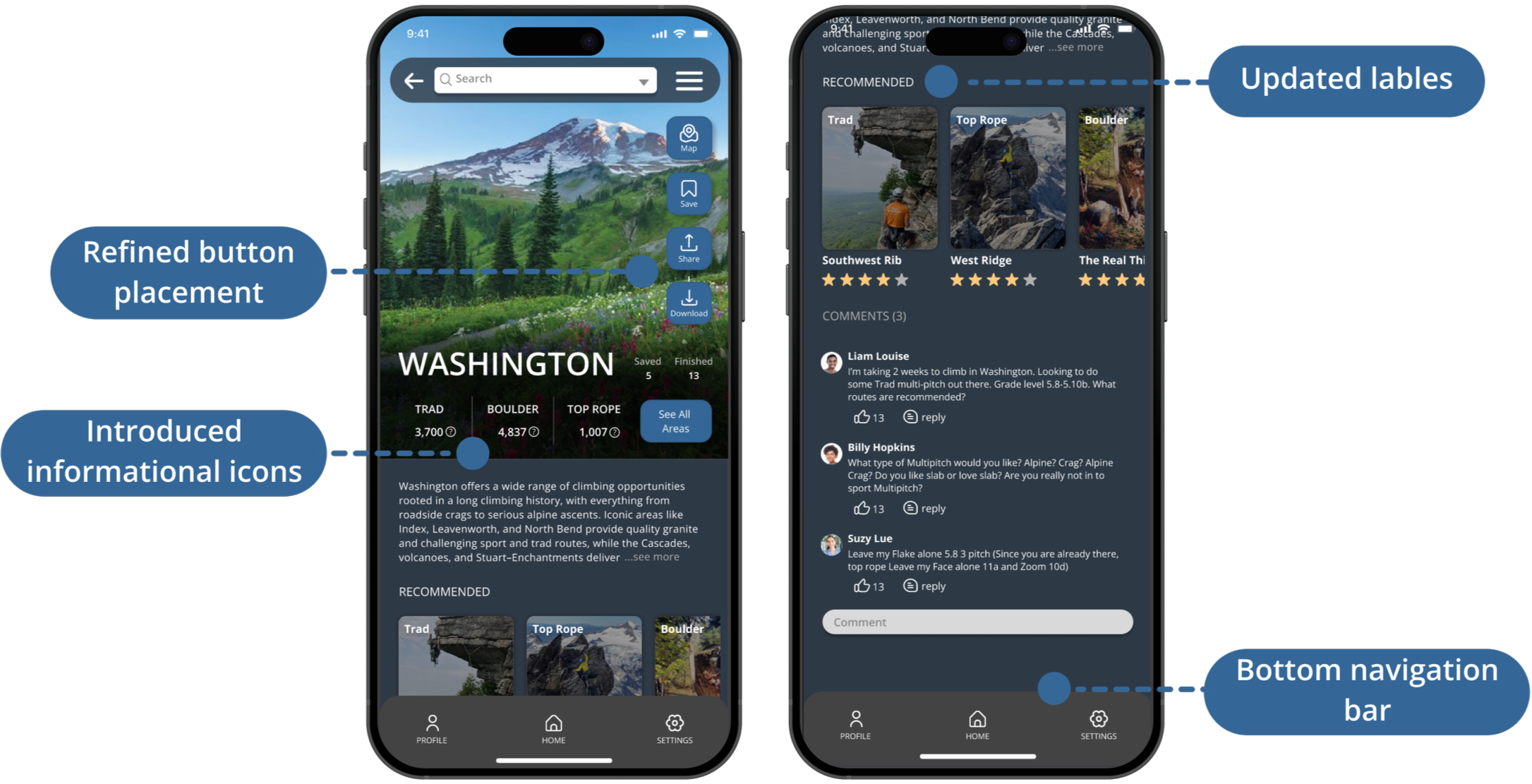
Climb Page
Created visual hierarchy by making the climb photo the main focus, improving readability
Introduced a persistent bottom navigation bar to improve way-finding
Implemented in-app commenting to foster community engagement
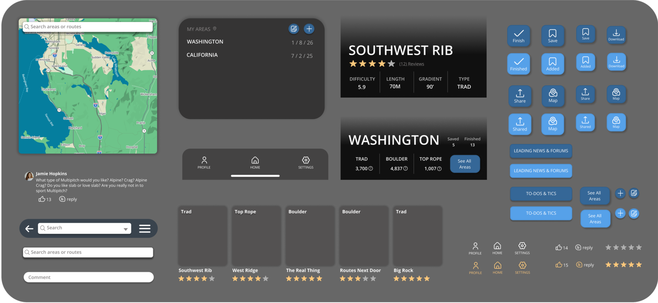
Component Library
Reflection
The original app featured a cluttered, poorly structured interface but contained valuable tools and content. The redesigned Mountain Project elevates the preexisting key features within a more open, digestible layout that improves scannability and visual hierarchy. While retaining the app’s core function of helping users discover climbs, the redesign emphasizes inclusive design, intuitive navigation, and readable informationarchitecture to support users of all skill levels. The updated visual system and refreshed UI components ensure the platform remains competitive while preserving its functional integrity.