GARDN
Concert/Festival Interactive Kiosk
Year: 2026
Scope: 5 weeks
Disciplines: Product Design, UX Design, UI Design
Making Event Spaces Approachable
Through team collaboration, my teammate and I design a digital data visualization experience or product that transforms a dataset into an interactive, exploratory interface.
I was in charge of create key the brand system, which includes typefaces, logo, icons, color pallet, and overall look to the information. I also produced the map, scavenger hunt page, secondary home page and loading animations. My partner Erin Ye produced the moving gradients, home page, photo booth page, and artist lineup page.
Product Statement
“We are designing for a festival attendee who struggles with navigating new spaces because of complicated venue layouts, crowded spaces, and a lack of engaging event features.”
Background
We were tasked with creating an application from scratch using three main identifiers. The application must solve an issue for a demographic whose needs are overlooked.
Scenario
Festival Or Public Event
We wanted to re-envision the festival experience by creating a tool that helps first-time navigators while also elevating the overall experience of music festivals and other public events.
Persona
The First-Time Navigator
We designed for festival goers attending the event for the first time who may feel unsure about how to move through the space. Our goal was to create an experience that encourages exploration while helping users feel more comfortable navigating the festival grounds.
Modifier
Engaging
GARDN introduces a new way to experience live music. It provides guidance on venue locations and lineup information while offering an engaging, low-cost secondary activity that helps users feel more immersed in the festival experience.
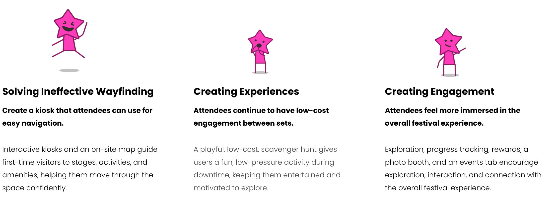
The Problem…
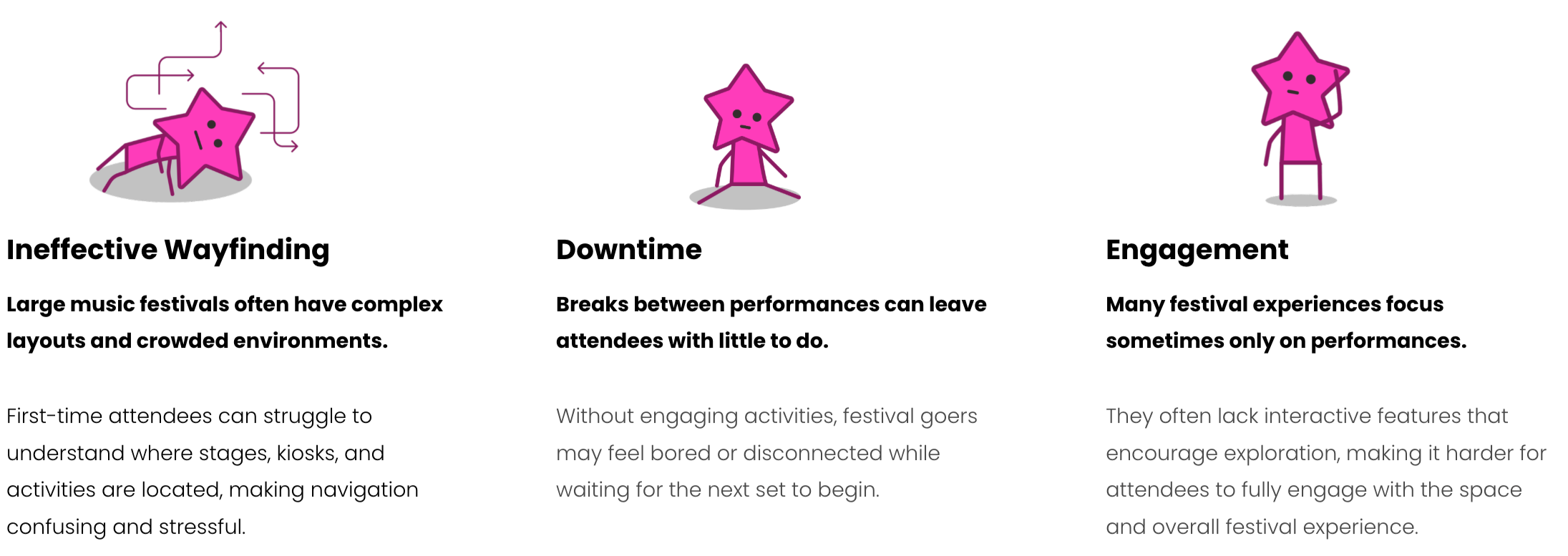
According to Students at WWU, Music Festivals are:
“theres so little do to outside of the performances”
“pretty confusing to navigate at first”
“theres a lack of activities to do unless your 21”
“intimidating and overwhelming at first”
According to Students at WWU, Kiosks are:
“alright at way-finding, but a lot of them are really slow and frustrating.”
“a little glitchy and slow, kind of convoluted.”
“only decent once I’ve used were at McDonald’s… so manypopups.”
“pretty simple and boring, I’ve never really thought about a kiosk before. ”
How can GARDN solve for this?
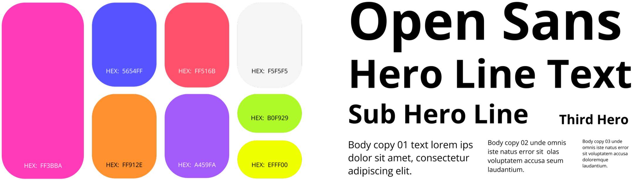
Color & Text Pallet
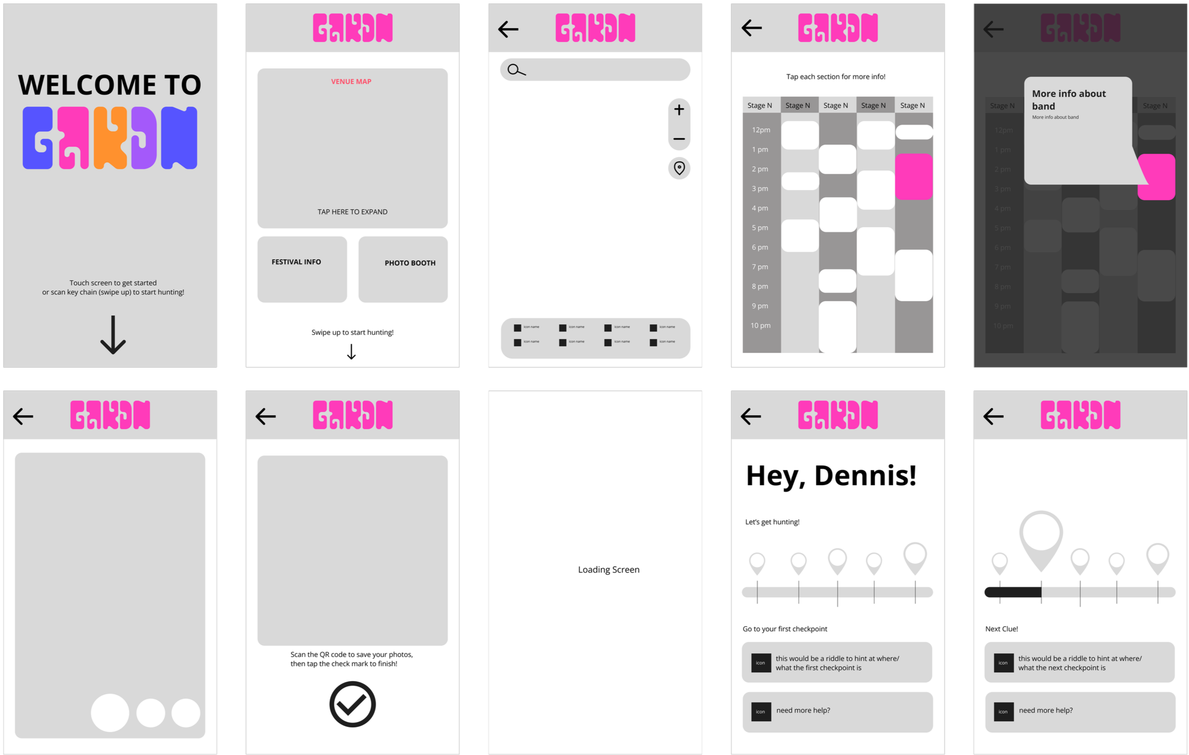
Wire Frames
Lo-Fi Wire Frames
First round of revisions, Implementing Brand Identity, setting blocks for key features.
Mid-Fi Wireframes
Second round of revisions. Creating detailed assets. After user testing, updated the scavenger hunt bar along with the homepage to be more intuitive and for better readability
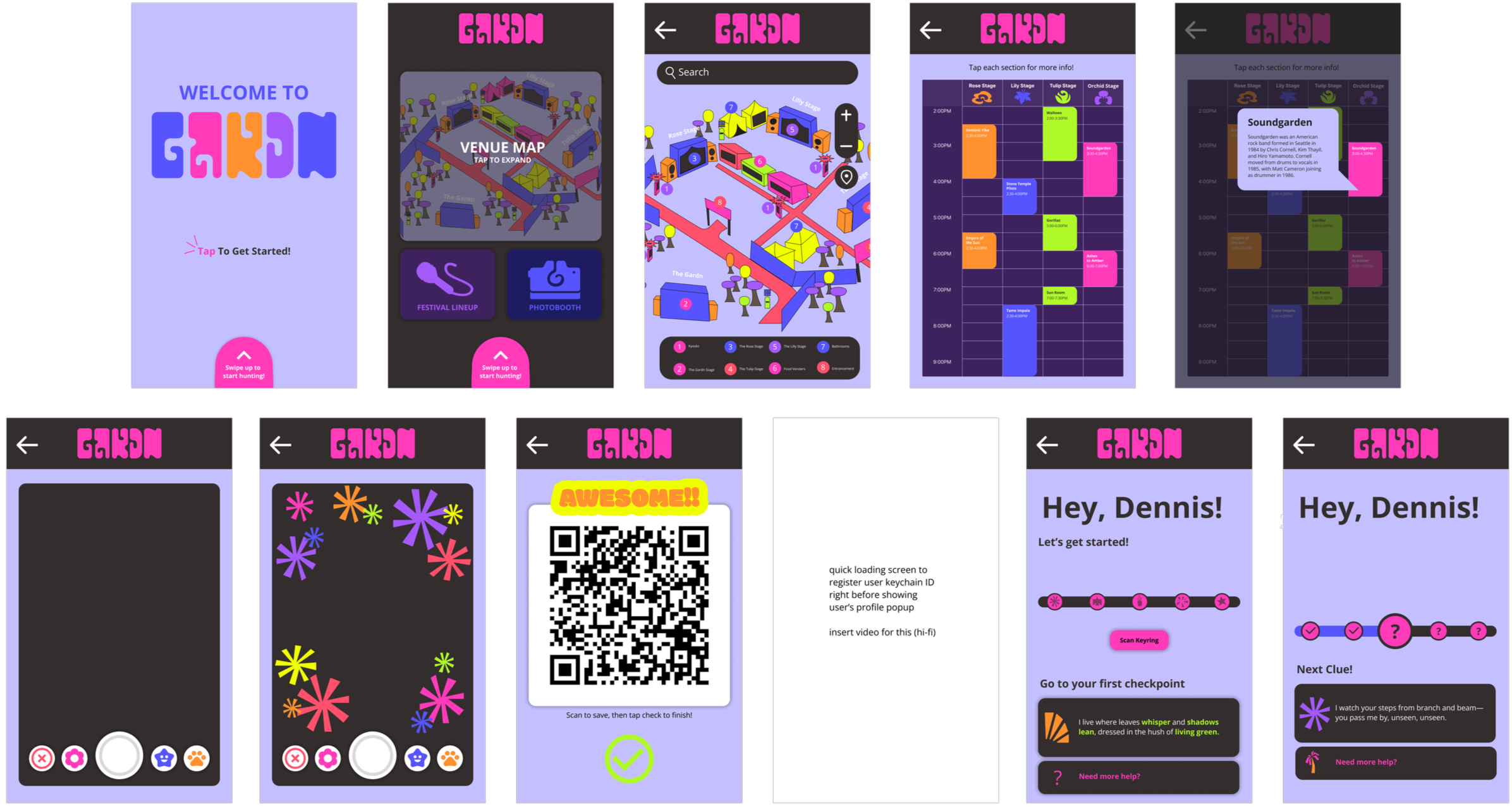
High-Fi
After User Testing, continued updating the scavenger hunt bar and implementing more assets such as smart animation and motion and loading screens.
After Usability Testing…
Overall navigation was clear and efficient for most users
Scavenger hunt navigation lacked intuitiveness
Directional arrows during the hunt were unclear and did not effectively communicate their function
Users had difficulty locating and understanding the scan feature
Some users experienced friction on the home page when attempting to start the scavenger hunt
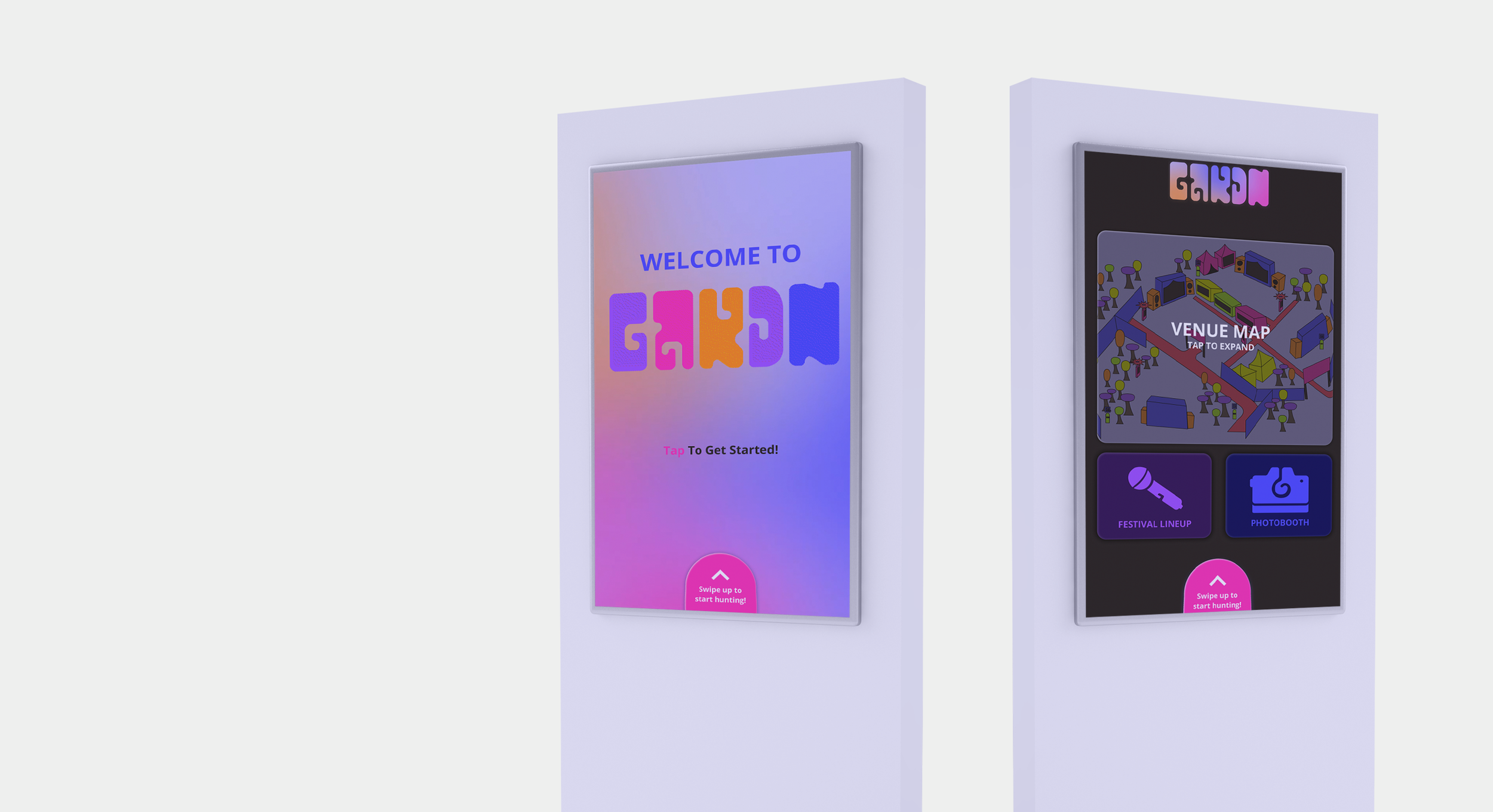
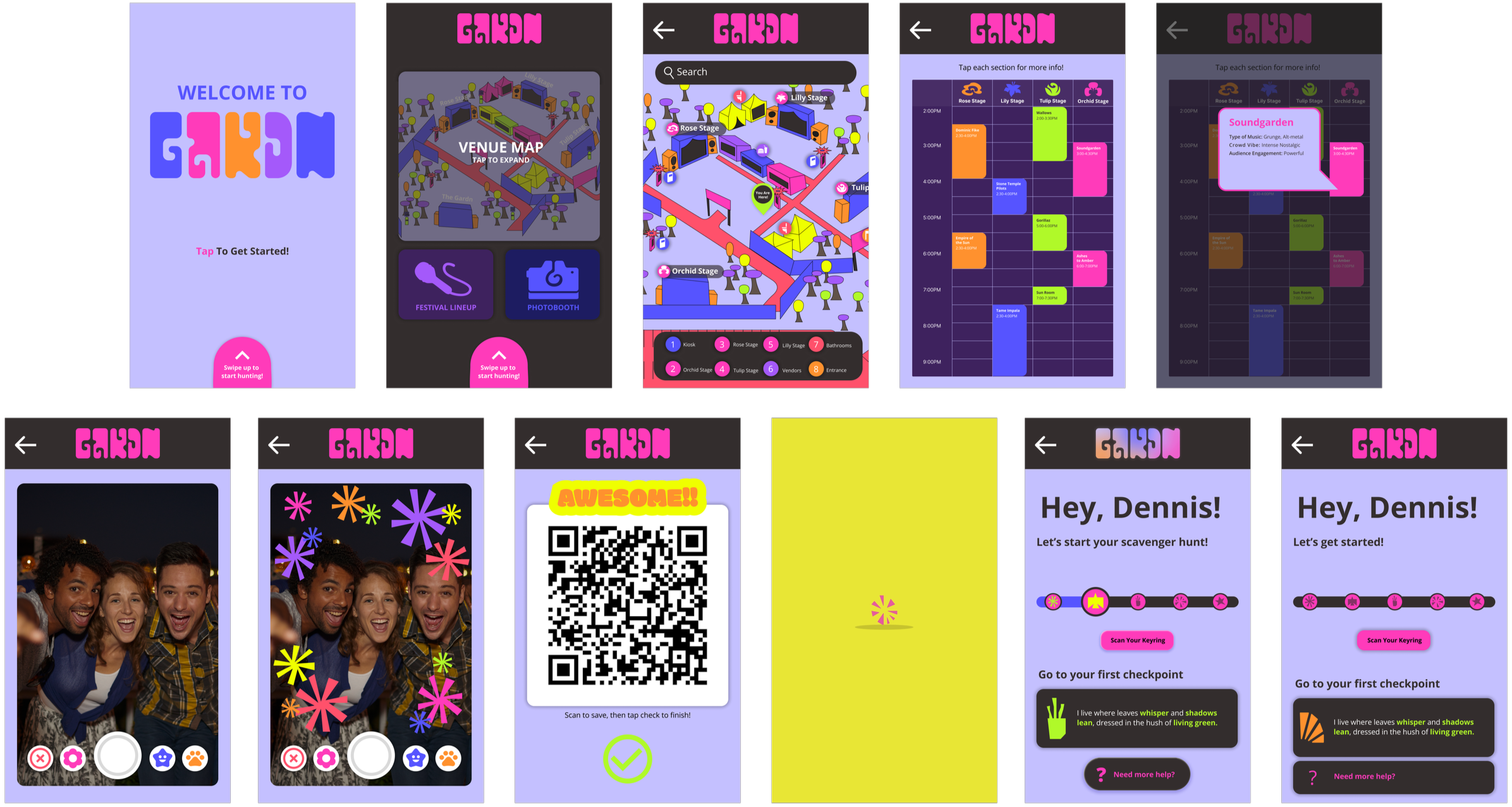
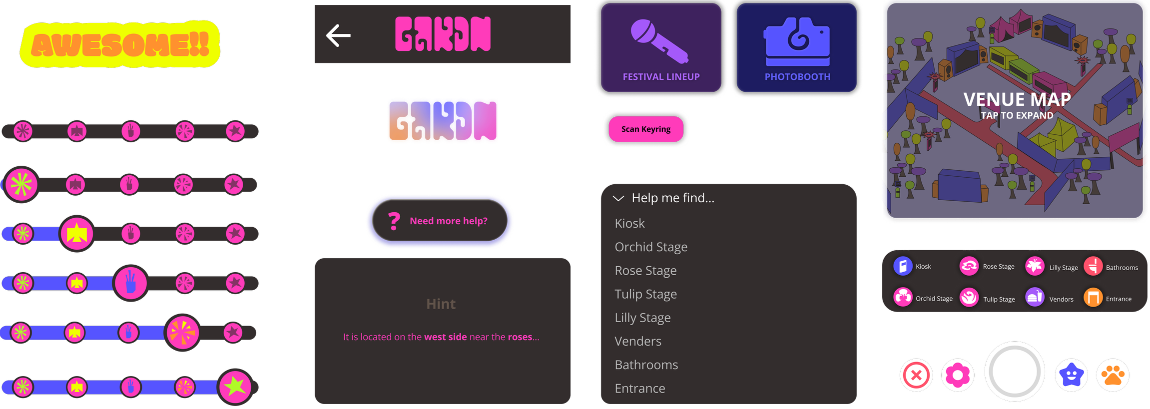
Final Prototype
Festival Map Navigation
Using recognizable icons and recommended spots bar to create intuitive, quick navigation. Added moving gradient and changing colors to idol screen to push brand further.
Photo Booth & Festival Info
Created Interactive festival info page and photo booth feature with playful visuals consistent with festival iconography. Improved pop outs for bands and artists performing by adding a stroke of color to enhance the type and the brand.
Scavenger Hunt Navigation
Quick and easy navigation that features a drop-down menu for efficient searching, using bold and identifiable icons. Added completion animation to emphasize the feeling of achievement.
Component Library
The Future of GARDN
To ensure that our buttons and color schemes are accessible to a wide variety of users, especially in a night time setting.
Refined Accessibility
Light Mode Interface
We would also explore a light-mode interface that would be dynamic with the time of day
Include how users would acquire the key chain for our scavenger hunt activity, and also look further into RFID systems and how we could integrate that with GARDN
Expanding Technology