Product Makeover
Objective is to “makeover” an outdated mobile application of choice. Taking light research and testing to then implement a new visual strategy that will take this product forward. This makeover includes reworking some of the user flow and a reapplication of the branding including typography, buttons, colors, grid/layout, icons, various ui components, possible photo or illustration styles.
Current State
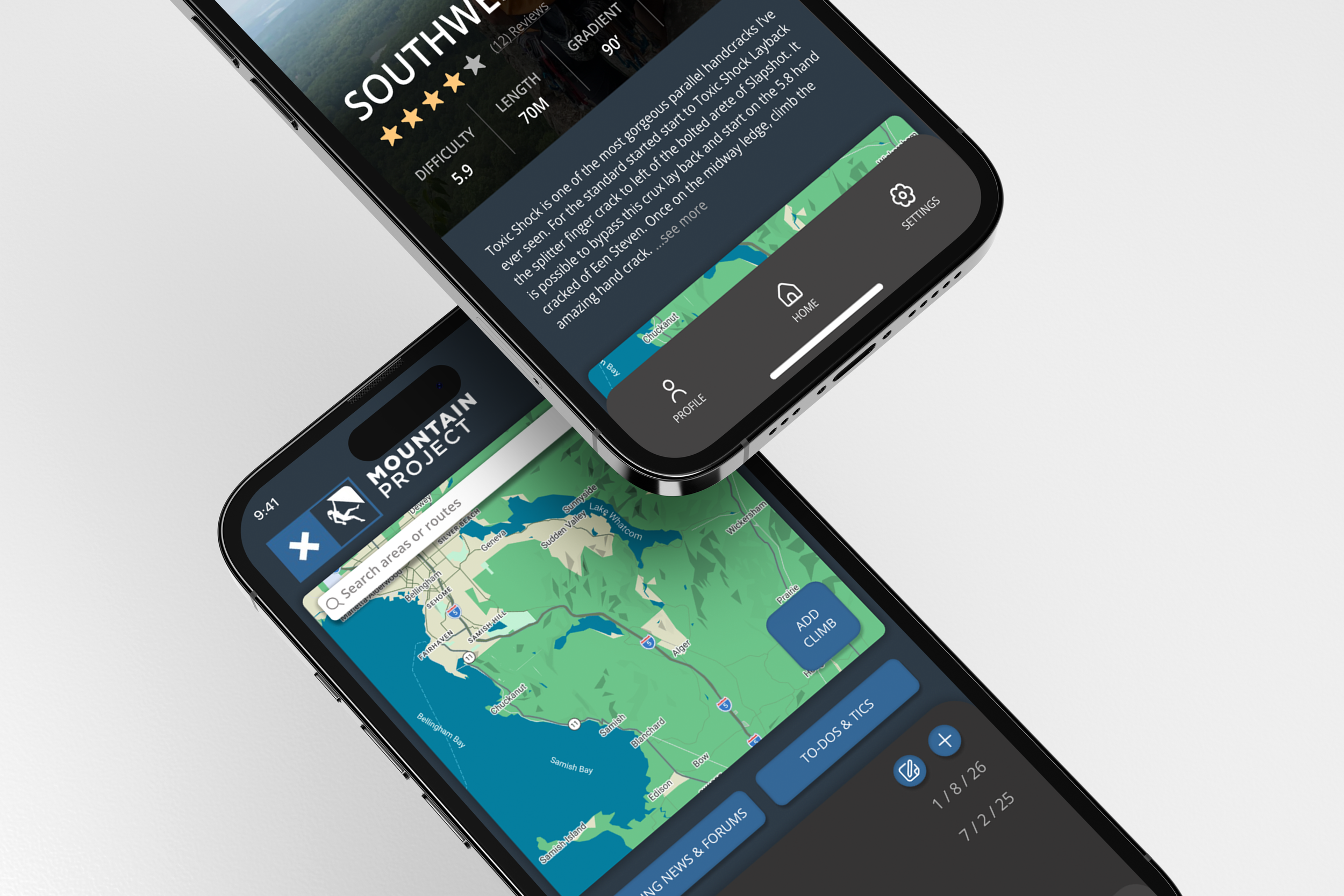
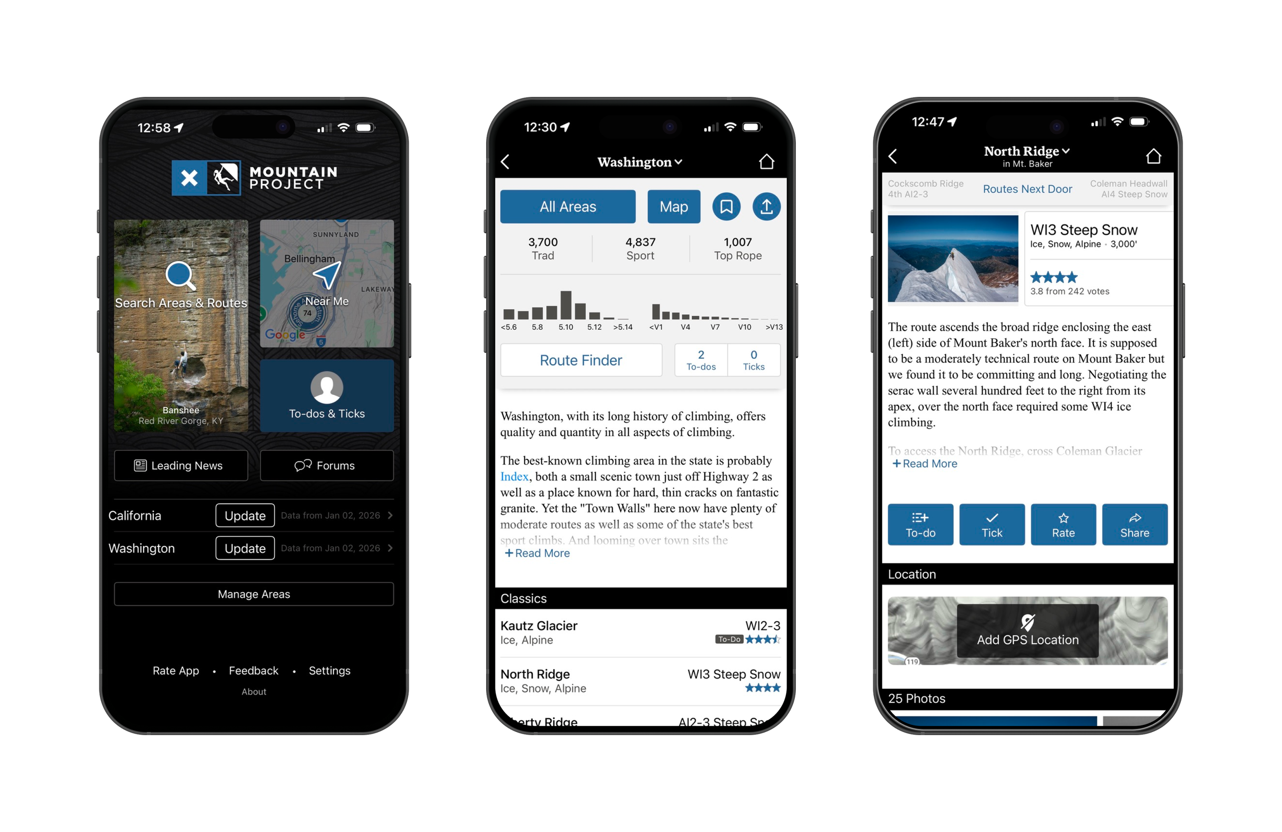
Mountain Project is a DIGITAL CLIMBING GUIDEBOOK — a community-powered database of climbing routes worldwide that climbers can access via web or mobile app.
OUTDATED UI, CONFUSING to navigate, UNCLEAR visual hierarchy, and technical language make it difficult—especially for beginners—to quickly understand labels and find the information they need.
User Needs Identified
Reliable offline access for remote climbing
Accurate route details, approach info, ratings
Easy navigation to desired climbs
Personal tick logging and route history
Comment community
User Pain Points
Downloading whole states vs specific climbs is inefficient.
Unable to comment on mobile
UI is outdated
Some content accuracy varies due to crowd-sourced input inconsistency
No home-bar
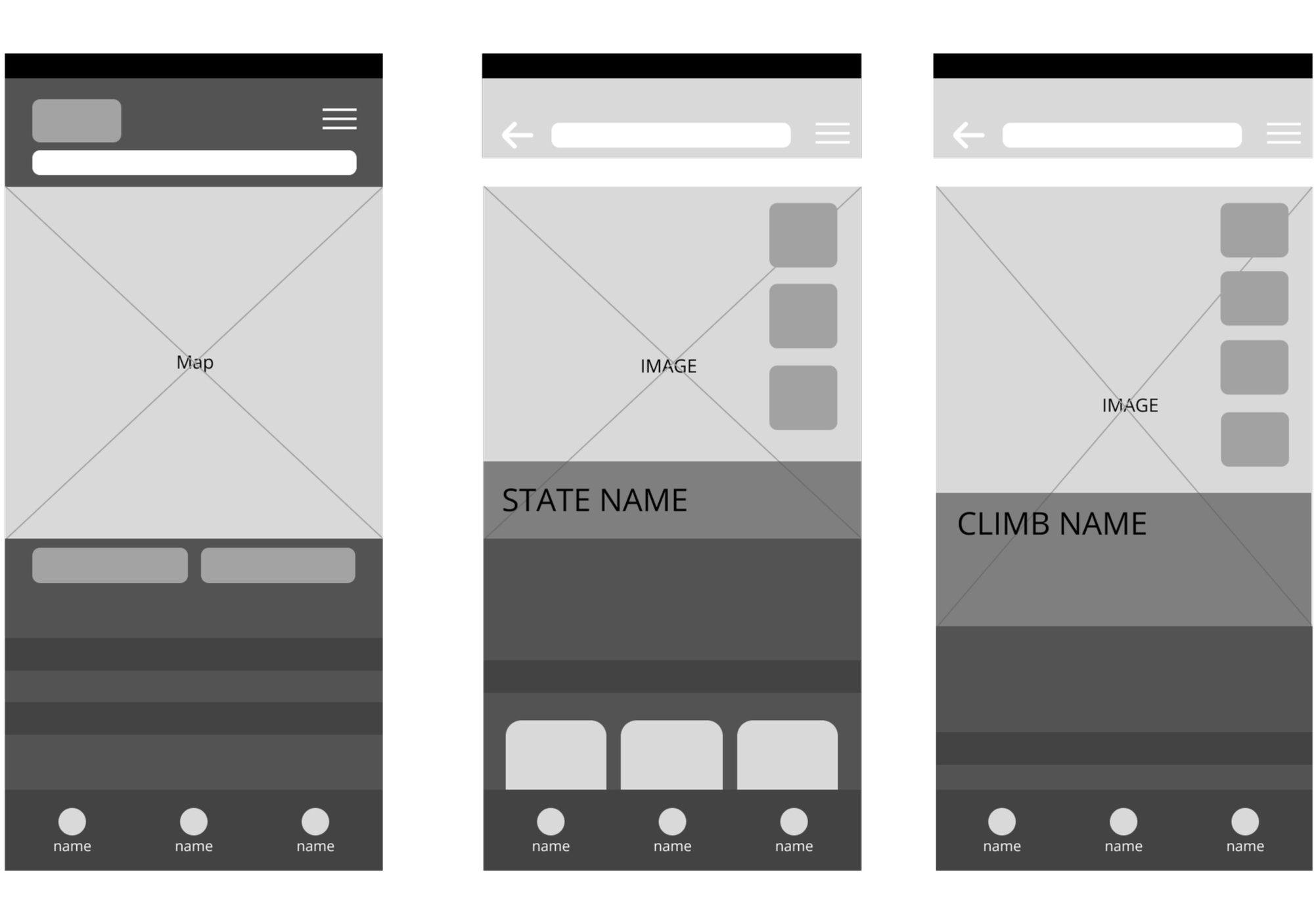
Wire Frames
My wireframes illustrate the placement of key components, including imagery, primary sections, and main action buttons, to establish a clear and intuitive layout.
Create a welcoming, easy-to-navigate app tailored to climbers of all experience levels. Improve usability by increasing visual spacing, adding clear written and visual labels, and updating the UI to create a more modern, efficient, and intuitive experience.
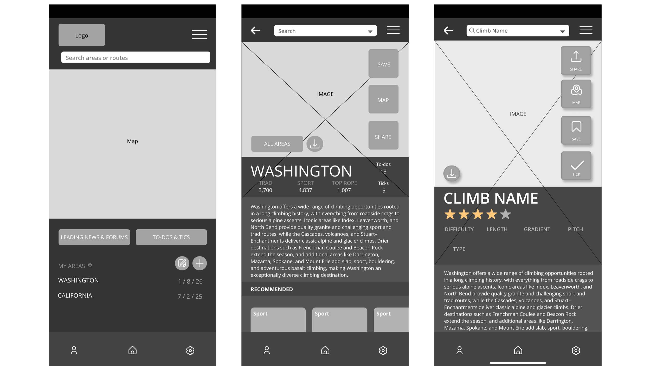
First Itteration
Compared to my wireframes, I created first iterations of icons, complete placement of buttons, text bubbles, headers, and recommended climbs.
Making clear heirchery within the sizing of imagery and text as well as placement of each category and button.
Final Solutions
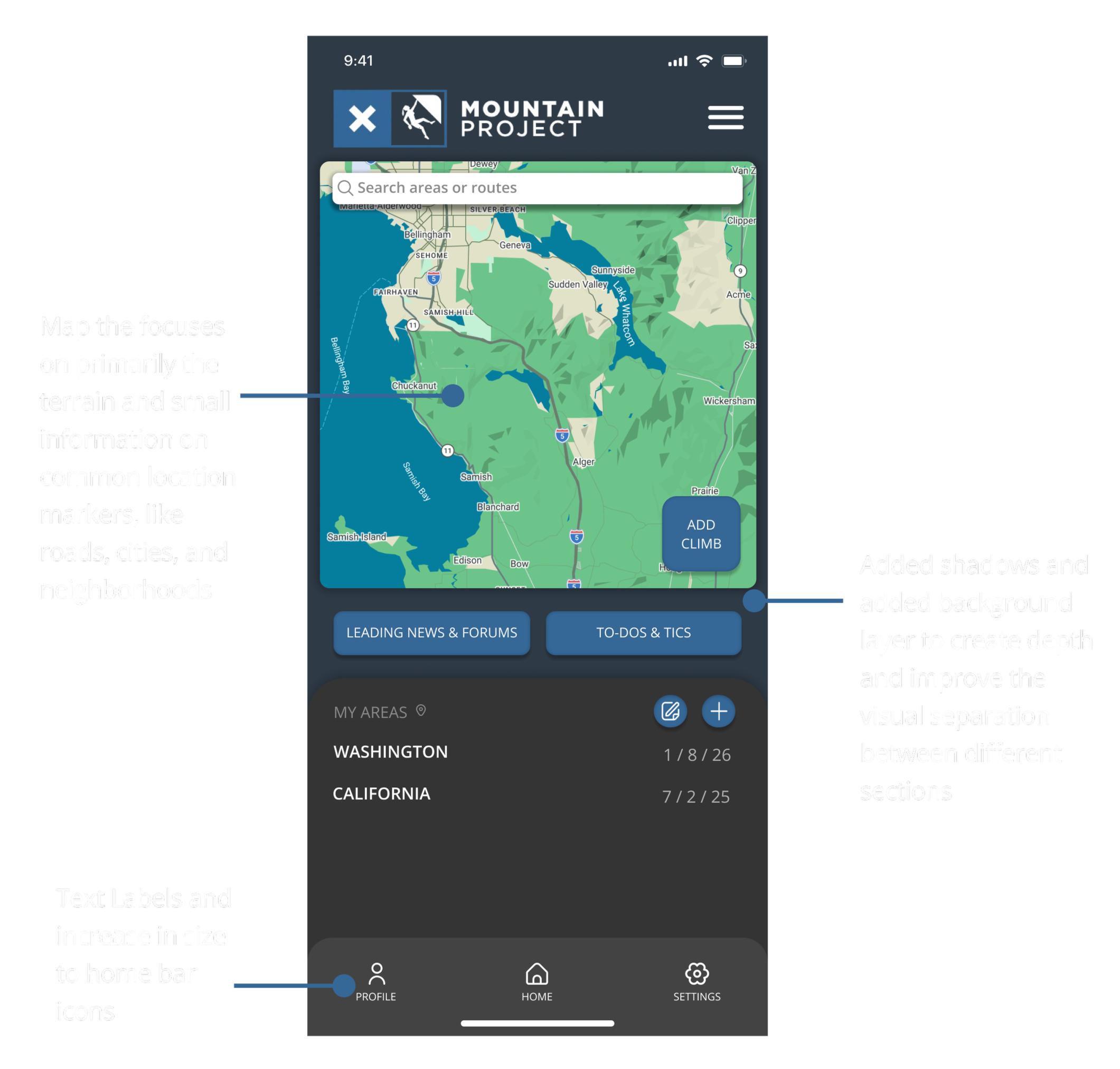
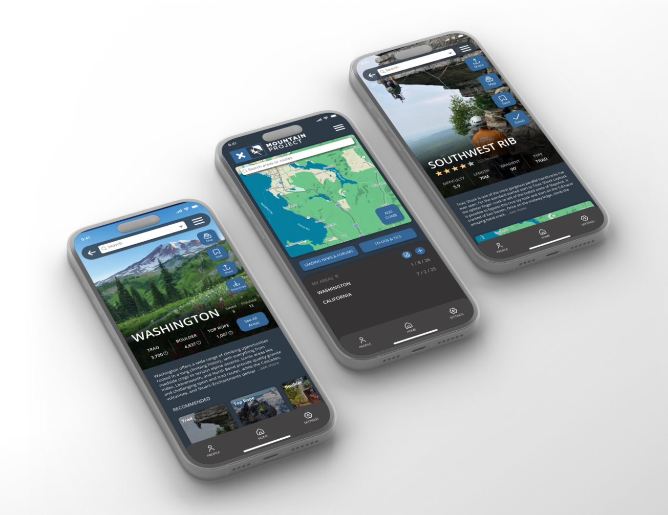
Home Page
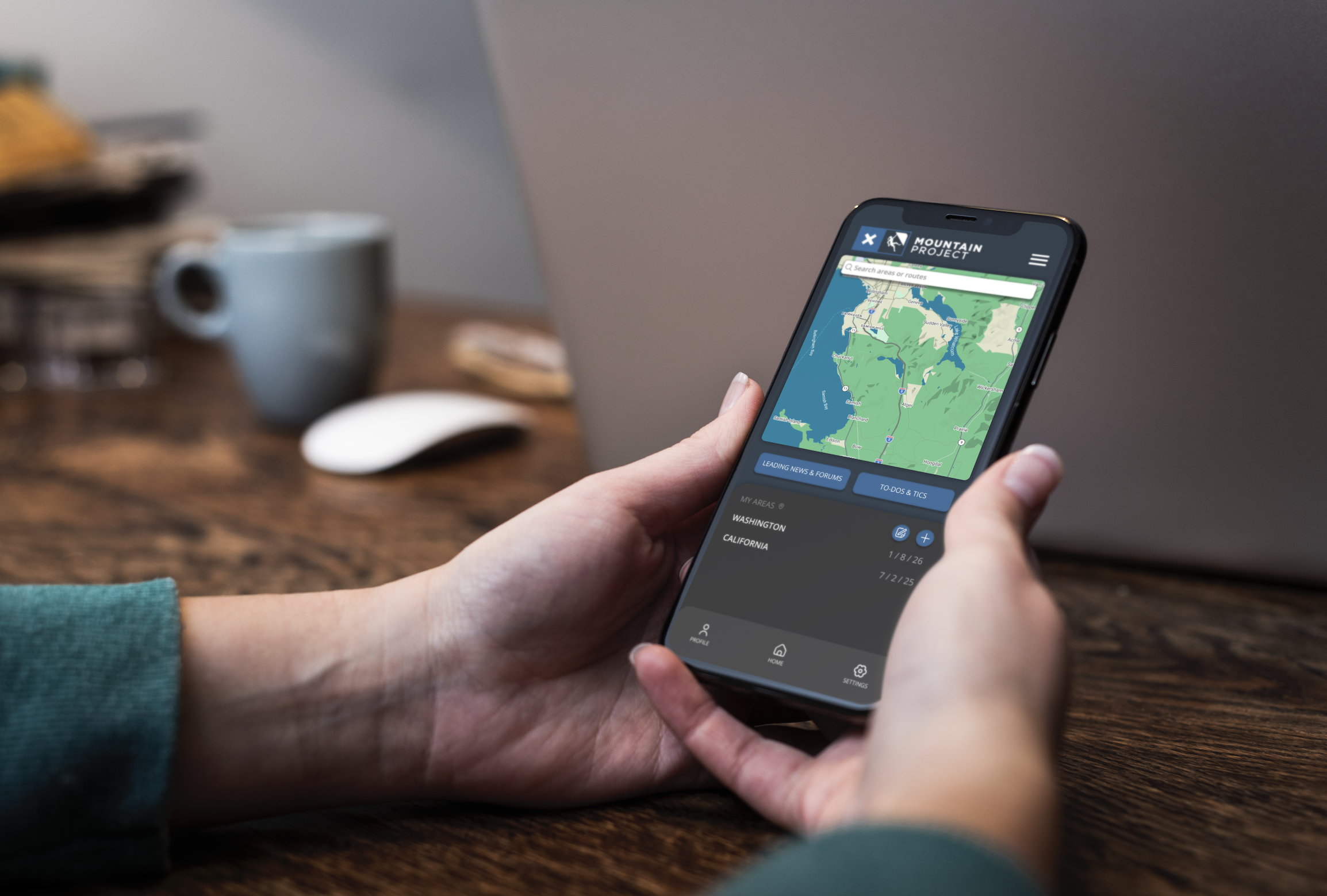
On the opening page, I established a clearer hierarchy by expanding the map as the primary feature and condensing secondary elements, such as the search bar and forums. I condensed secondary and highlighted main features of the app while bringing organized sections that make for a clean and readable layout.
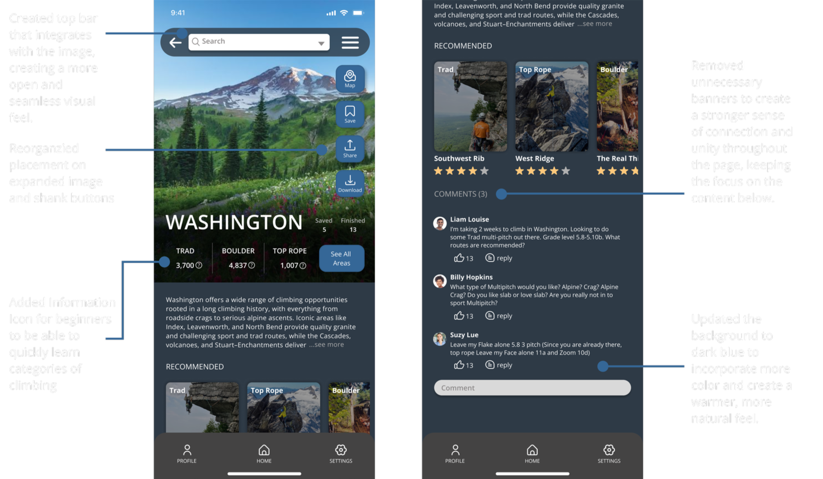
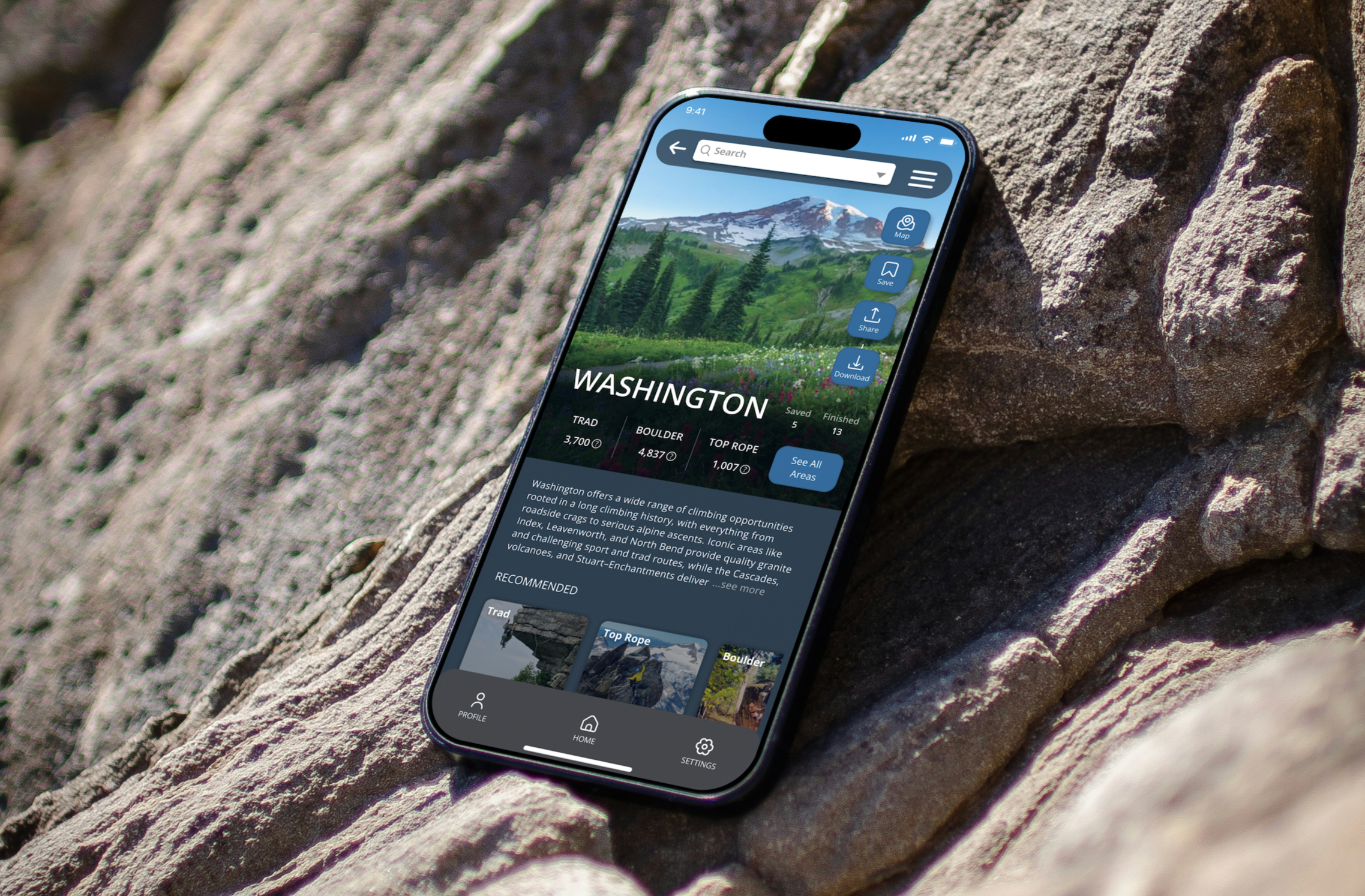
States Page
On the states page, I introduced a representative image for each state to help users better understand the environment at a glance. I refined the layout by spacing out and condensing information, and I created a dedicated area for user comments to connect the community even more.
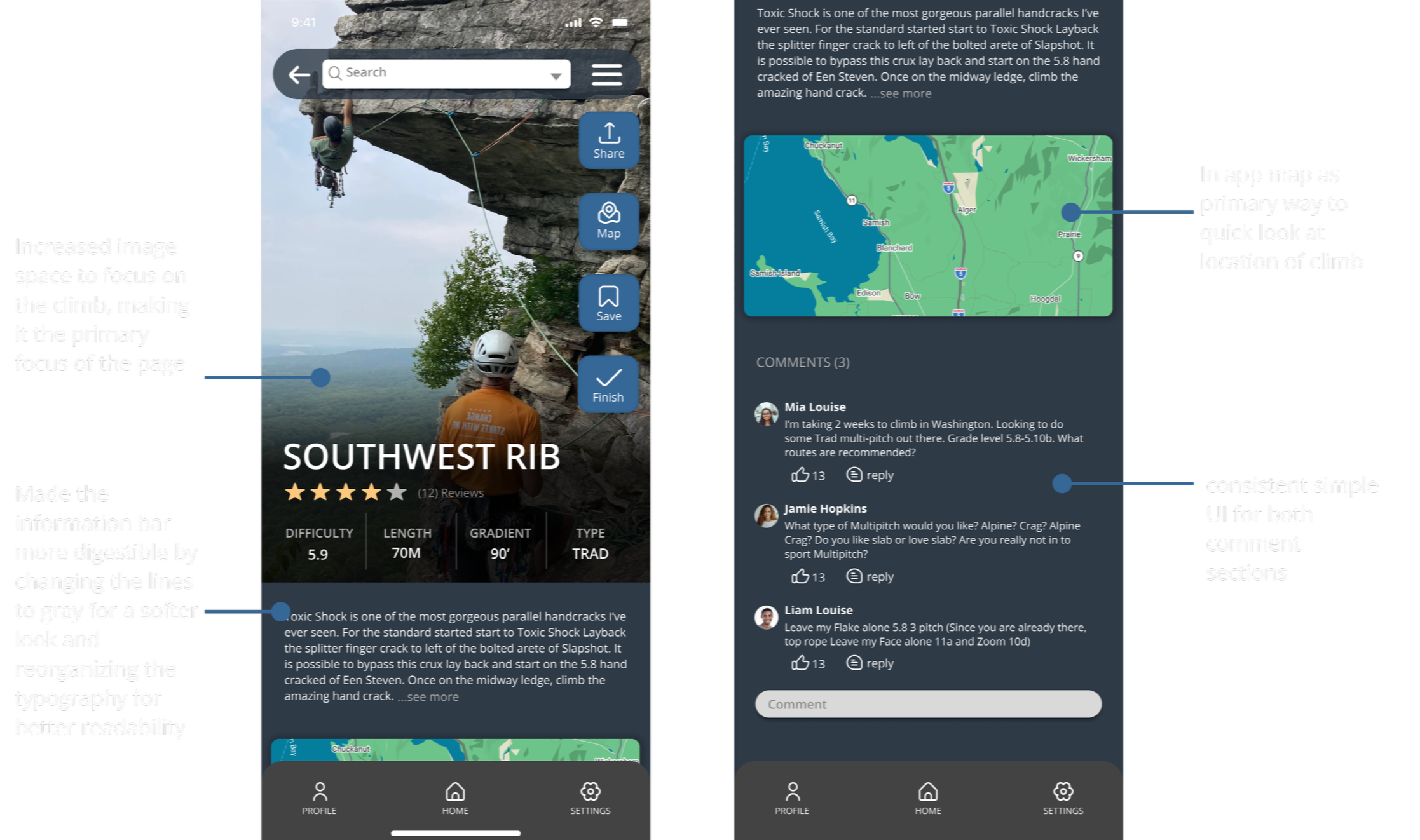
Climb Page
On the Climb page, I applied a similar approach by enlarging the main climb image, simplifying the information and layout, and adding a comment section identical to the states page. I also ensured consistency by using the same primary map from the home page, creating a more cohesive experience across the app.

Audience
The original Mountain Project serves climbers who are of higher skill levels and already well versed in rock climbing language, helping them discover climbs in various areas. While many use the app primarily to find climbs, some turn to the website or other platforms for a more user-friendly experience and a stronger sense of community. My goal was to address this by creating a space where climbers of all levels can easily discover climbs in their area while also making the app more inclusive and supportive of community building.
Goals & Painpoints
The original app had a outdated, poorly organized, crammed layout but with valuable tools and information. The improved Mountain Project highlights the already extinguishing tools with a more digestible, open and cleaned up layout. The original purpose of the app was for anyone to be able to find climbs in the area. I still wanted the app to center around that idea but truly accessible for all users while giving a fresh new look to remain competitive with other platforms.